

Introduction: Why Color Theory Matters in UX/UI Design
Color is one of the most powerful tools in design.
Before users read text or understand layout, they notice colors. Colors influence emotions, attention, decision-making, and even trust.
In UX/UI design, color is not chosen randomly. It is selected strategically.
A well-chosen color palette can:
-
Improve readability
-
Guide user attention
-
Increase conversions
-
Strengthen brand identity
-
Enhance emotional connection
Poor color choices can:
-
Confuse users
-
Reduce accessibility
-
Lower trust
-
Decrease engagement
That is why understanding color theory is essential for every UX/UI designer.
At TechCadd Mohali, students learn how to use colors professionally rather than randomly.
What is Color Theory?
Color theory is a set of principles used to create harmonious color combinations.
It explains:
-
How colors relate to each other
-
How colors mix
-
How colors create contrast
-
How colors influence emotions
Color theory provides a scientific and artistic foundation for selecting color palettes.
Understanding the Color Wheel


The color wheel is a circular diagram that organizes colors based on their relationships.
It was first introduced by Sir Isaac Newton and later refined by artists and designers.
The traditional color wheel consists of 12 colors:
1. Primary Colors
-
Red
-
Blue
-
Yellow
Primary colors cannot be created by mixing other colors.
2. Secondary Colors
Created by mixing two primary colors:
-
Red + Yellow = Orange
-
Yellow + Blue = Green
-
Blue + Red = Purple
3. Tertiary Colors
Created by mixing a primary and a secondary color:
-
Red-Orange
-
Yellow-Orange
-
Yellow-Green
-
Blue-Green
-
Blue-Purple
-
Red-Purple
Understanding these relationships helps designers create balanced palettes.
Warm Colors vs Cool Colors
Colors are divided into two temperature categories:
Warm Colors
-
Red
-
Orange
-
Yellow
They create feelings of:
-
Energy
-
Passion
-
Urgency
-
Warmth
Used often in:
-
Call-to-action buttons
-
Sale promotions
-
Food apps
Cool Colors
-
Blue
-
Green
-
Purple
They create feelings of:
-
Trust
-
Calmness
-
Stability
-
Professionalism
Used often in:
-
Banking apps
-
Healthcare apps
-
Educational platforms
Understanding temperature helps designers control emotional tone.
Color Harmony in UX/UI Design
Color harmony refers to visually pleasing color combinations.
Let’s explore common harmony types.
- Complementary Colors
-
Complementary colors are opposite each other on the color wheel.
Examples:
-
Blue & Orange
-
Red & Green
-
Yellow & Purple
They create strong contrast and visual impact.
Used for:
-
CTA buttons
-
Highlight elements
-
Important notifications
2. Analogous Colors
4Analogous colors sit next to each other on the wheel.
Examples:
-
Blue, Blue-Green, Green
-
Yellow, Yellow-Orange, Orange
They create harmonious and smooth designs.
Used for:
-
Background gradients
-
Branding
-
Soft interfaces
3. Triadic Colors
4Triadic colors are evenly spaced around the wheel.
Example:
-
Red, Blue, Yellow
They create vibrant and balanced contrast.
Used in:
-
Creative websites
-
Youth brands
-
Gaming apps
Color Psychology in UX/UI
Colors influence user emotions.
Red
-
Urgency
-
Energy
-
Alert
Used in sales and error messages.
Blue
-
Trust
-
Stability
-
Professionalism
Common in banking and corporate websites.
Green
-
Growth
-
Success
-
Health
Used in fintech and healthcare apps.
Yellow
-
Optimism
-
Attention
Used for highlights.
Purple
-
Luxury
-
Creativity
Used in premium branding.
Designers must align color psychology with brand goals.
Contrast and Accessibility
Good color contrast improves readability.
Low contrast causes:
-
Eye strain
-
Poor accessibility
-
Confusion
Important rules:
-
Maintain high contrast between text and background
-
Avoid light grey text on white background
-
Follow WCAG contrast guidelines
Accessibility ensures designs work for:
-
Color-blind users
-
Visually impaired users
-
Elderly users
Inclusive design expands audience reach.
Creating a Professional Color Palette
Steps to create a strong palette:
-
Choose a primary brand color
-
Select 1–2 secondary colors
-
Add neutral colors (white, grey, black)
-
Define success, warning, error colors
-
Maintain consistent usage
Avoid using too many random colors.
Consistency builds trust.
Dark Mode and Light Mode Design
Modern apps support dark mode.
Design considerations:
-
Avoid pure black (#000000)
-
Use soft dark greys
-
Maintain contrast
-
Adjust shadows and highlights
Color palettes must adapt to both light and dark themes.
Common Color Mistakes in UI Design
Avoid:
-
Overusing bright colors
-
Ignoring accessibility
-
Using too many primary colors
-
No hierarchy
-
Random gradient usage
Professional color use is strategic, not emotional.
Color Theory in Branding
Brand identity depends heavily on color.
Examples:
-
Blue brands feel trustworthy
-
Red brands feel energetic
-
Green brands feel eco-friendly
Consistent color usage builds recognition.
Tools for Choosing Colors
Designers use tools like:
-
Figma color styles
-
Adobe Color
-
Coolors
-
Contrast checker tools
These tools help generate harmonious palettes.
Practical Application in UX/UI Projects
In real projects:
-
Use one dominant color
-
Use accent color for CTA
-
Maintain spacing
-
Keep background neutral
-
Use subtle shadows
Color supports structure — it should not overpower it.
Why Learn Color Theory at TechCadd Mohali?
At TechCadd Mohali, students learn:
-
Practical color application
-
Real UI case studies
-
Design system building
-
Accessibility standards
-
Portfolio-ready projects
Understanding color theory improves design maturity.
Final Thoughts
Color theory is not just about mixing colors. It is about creating emotional impact, improving usability, and strengthening brand identity.
A professional UX/UI designer must understand:
-
The color wheel
-
Harmony types
-
Color psychology
-
Contrast rules
-
Accessibility
-
Brand consistency
When used correctly, color becomes a powerful communication tool.
Mastering color theory can transform an average design into a professional one.
And professional designers always design with purpose — not guesswork.
-
-
Advanced Color Theory Concepts for UX/UI Designers
Understanding basic color relationships is important, but professional UX/UI designers go deeper. Advanced color theory helps designers create scalable systems, improve usability, and build strong brand identities.
Let’s explore deeper concepts that elevate your design maturity.
Understanding Hue, Saturation, and Value (HSV Model)
To control colors properly, designers must understand three key properties:
1. Hue
Hue refers to the base color itself — red, blue, green, etc.
On the color wheel, hue changes as you move around the circle.
2. Saturation
Saturation defines the intensity of a color.
-
High saturation = vibrant and bold
-
Low saturation = muted and soft
Highly saturated colors are energetic but can feel overwhelming if overused.
Professional UI designs often use medium or slightly muted saturation for a premium feel.
3. Value (Brightness)
Value determines how light or dark a color is.
-
High value = lighter color
-
Low value = darker color
Adjusting value helps create hierarchy and depth in UI.
Understanding HSV allows designers to create multiple shades of the same color without losing harmony.
RGB vs CMYK in Digital Design
UX/UI designers primarily work with digital platforms, so understanding color models is important.
RGB (Red, Green, Blue)
Used for digital screens.
Colors are created by combining light.
More light = brighter colors.
All digital apps, websites, and interfaces use RGB.
CMYK (Cyan, Magenta, Yellow, Black)
Used for print design.
Colors are created by mixing ink.
UX/UI designers should focus mainly on RGB but understand CMYK when creating marketing materials.
The Role of Neutral Colors in UI
Many beginners focus only on vibrant colors.
But professional interfaces rely heavily on neutral tones:
-
White
-
Light grey
-
Dark grey
-
Black
-
Off-white
Neutral colors:
-
Reduce visual noise
-
Improve readability
-
Allow accent colors to stand out
-
Create a premium look
Most modern apps use 70–80% neutral tones and only 20–30% accent colors.
This balance creates sophistication.
Color Hierarchy in Interface Design
Color should guide users naturally.
A strong color hierarchy includes:
Primary Color
Used for main actions (CTA buttons).
Secondary Color
Used for supporting elements.
Accent Color
Used for highlights or alerts.
Neutral Background
Used to keep focus on content.
Without hierarchy, interfaces look chaotic.
Color hierarchy improves usability.
Monochromatic Color Schemes

 4
4Monochromatic schemes use different shades, tints, and tones of a single color.
Example:
Light Blue → Medium Blue → Dark BlueBenefits:
-
Clean and minimal look
-
Easy to maintain consistency
-
Reduces visual conflict
Monochromatic palettes are popular in SaaS dashboards and corporate websites.
Split Complementary Color Scheme
 4
4Instead of using exact opposites on the color wheel, split complementary uses:
-
One base color
-
Two adjacent colors of its complement
This creates contrast but is less aggressive than full complementary.
Good for balanced yet dynamic UI designs.
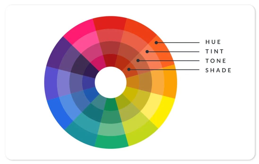
Tints, Shades, and Tones in UI
Professional color systems include variations.
Tint
Adding white to a color.
Shade
Adding black to a color.
Tone
Adding grey to a color.
Using tints and shades helps:
-
Create button states
-
Show hover effects
-
Build depth
-
Create layered UI
For example:
Primary Blue:
-
Light Blue (hover state)
-
Dark Blue (pressed state)
This improves interaction clarity.
The 60-30-10 Rule in UI Design
This classic interior design rule also works in UI.
-
60% dominant color (usually neutral background)
-
30% secondary color
-
10% accent color
This rule maintains balance and prevents color overload.
Many successful websites unknowingly follow this structure.
Emotional Branding Through Color
Brand identity is built around emotional consistency.
For example:
-
Banking apps use blue to signal trust.
-
Fitness apps use red/orange to signal energy.
-
Eco brands use green to signal sustainability.
Choosing a brand color without understanding psychology weakens brand impact.
Color must match brand personality.
Cultural Differences in Color Meaning
Color perception varies globally.
For example:
-
White symbolizes purity in Western culture but mourning in some Asian cultures.
-
Red symbolizes danger in some regions but celebration in others.
Designers working on global products must research cultural meanings before finalizing color schemes.
Color Blindness and Inclusive Design
Around 8% of men and 0.5% of women globally experience color blindness.
Common types:
-
Red-green color blindness
-
Blue-yellow color blindness
To design inclusively:
-
Avoid relying only on color to communicate information
-
Use icons or labels along with color
-
Test with color blindness simulators
-
Maintain strong contrast
Inclusive design increases usability and professionalism.
Using Gradients in Modern UI
Gradients are popular in modern design.
Best practices:
-
Use subtle transitions
-
Avoid overly bright combinations
-
Maintain readability
-
Ensure text contrast remains strong
Gradients add depth and vibrancy when used correctly.
Flat Design vs Neumorphism vs Glassmorphism
Modern UI trends influence color usage.
Flat Design
Uses solid colors and minimal shadows.
Neumorphism
Uses soft shadows with subtle color variations.
Glassmorphism
Uses translucent layers and blurred backgrounds.
Each trend requires thoughtful color handling to maintain clarity.
Color in Micro-Interactions
Colors can change dynamically during interaction.
Examples:
-
Button changes color on hover
-
Error fields turn red
-
Success messages turn green
-
Toggle switches animate color change
Micro-interactions use color feedback to communicate system status.
Without feedback, users feel uncertain.
Accessibility Contrast Ratios
To maintain readability:
-
Normal text: 4.5:1 contrast ratio
-
Large text: 3:1 contrast ratio
Using online contrast checkers ensures compliance with accessibility standards.
Professional designers always test contrast.
Building a Scalable Color System in Figma
When designing professionally:
-
Create color styles
-
Define primary/secondary tokens
-
Create semantic colors (Success, Error, Warning)
-
Use naming conventions
Example:
-
Primary / 100
-
Primary / 200
-
Neutral / 50
-
Error / Base
This makes collaboration easier with developers.
Common Beginner Mistakes in Color Usage
Avoid:
-
Using too many bright colors
-
Ignoring white space
-
No consistent palette
-
Using random gradients
-
Not testing dark mode
-
Poor contrast
Professional design is controlled, not flashy.
Case Study Example: Applying Color Theory in a Course Website
Imagine designing a UX/UI course website.
You might:
-
Use dark blue as primary (trust & professionalism)
-
Use orange as CTA accent (energy & action)
-
Use white/grey for background
-
Use green for success messages
-
Use red for errors
This creates balance, clarity, and brand identity.
Future of Color in Digital Design
Emerging trends include:
-
Dynamic color systems
-
AI-generated color palettes
-
Adaptive UI based on environment
-
Personalized theme settings
Technology will evolve, but color psychology fundamentals will remain essential.
-


Comments
No comments yet. Be the first to comment.
Leave a Comment